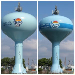
OCEAN CITY — With what one councilmember described as “the most debated thing we’ve done in a long time,” the Ocean City Council on Tuesday finally approved the final design for the painting of the water tower at 64th Street.
Over the last several months, Ocean City officials have debated the design for the municipal water tower at 64th Street near the Route 90 entrance to the resort. The discussion moved from a Coca-Cola-sponsored design to a golf ball and tee design including the town’s Eagle’s Landing logo to a replica of the beach ball design at 1st Street to basic blue.
Last week, the more grandiose designs including the Eagle’s Landing golf ball and tee and replicating the downtown beach ball design were taken off the table largely because of costs concerns. Instead, the majority of the council endorsed essentially repainting the tower with its existing design including the basic light blue color with a darker blue stripe around the middle and with the town’s sunburst logo and a welcoming and thank you for visiting message on either side.
Even then, the debate was not over. The council instructed Public Works Director Hal Adkins and his staff to go back to the lowest bidder and get yet another cost estimate for the basic blue paint job with the sunburst logo and messaging without the distinctive darker blue stripe. On Tuesday, Adkins returned with yet another rendering showing the water tower painted in a pale blue color with the same logo and messaging without the blue stripe, which came in a little under $5,000 cheaper.
However, continuing a trend that began months ago, the council could not reach a clear consensus on the final design. Adkins renewed the debate during Tuesday’s work session with a recap of the latest developments in the 64th Street water tower paint scheme decision process.
“I left last week with the understanding we were left with the basic blue paint job with the town’s sunburst logo with the dark blue band being the top choice,” he said. “I was requested to go back and look at an alternative concept, which I am presenting today, without the blue band. What I’m hoping for today is to get approval one way or the other because it is our intent to do this project this fall.”
Councilman Tony DeLuca made a motion to accept the basic pale blue design without the blue stripe.
“I think it’s a much simpler design,” he said. “It’s a much cleaner look.”
Councilman Wayne Hartman agreed with the simpler design and its roughly $5,000 in cost savings. However, Councilman John Gehrig took the blue-stripe debate a step further, opining for the minimum cost increase, the latter represented a much better design. Gehrig also pointed out that at around $220,000, retaining the existing blue stripe still came under what was budgeted for the project at around $250,000.
“It just doesn’t look good,” said Gehrig of the plain blue design with no dark blue stripe. “If we’re going to do it, let’s do it right. If we’re going to spend the money to make it look good, let’s make it look good. If we don’t care how it looks, let’s just leave it plain blue with no logo or messaging.”
Council Secretary Mark Knight also advocated for keeping the blue stripe in the design.
“I don’t think it stands out without the blue stripe,” she said. “The town’s logo looks too small.”
In the end, the motion for painting the tower without the stripe failed by a 3-4 vote with DeLuca, Dare and Hartman on the losing side. A motion to approve the tower paint job with the blue stripe then passed on a 4-3 vote with Council President Lloyd Martin, Knight, Gehrig and Councilman Matt James in favor.

